BRANDING & COLLATERAL
SHELL DRIFT SURF.co

Say G'day to Shell Drift Surf.co
A sunny Queensland-based surf school that’s all about good vibes, salty hair, and living in tune with the ocean. They offer surf lessons for everyone, from first-timers learning to pop up, to seasoned surfers chasing the perfect break. But they’re more than just waves — Shell Drift brings the community together with yoga by the sea, balance classes, and events that embrace movement and mindfulness.
The challenge? Their branding didn’t reflect the joyful, down-to-earth spirit of their community. It lacked the playfulness and warmth that defines their experience — especially for the groms (kids) who adore swimming with the turtles.
How I helped: I created a coastal-inspired visual identity that’s fun, inviting, and just the right amount of cheeky. Think soft beachy tones, carefree typography, and a lovable turtle mascot that makes kids (and adults) smile. The result? A brand that feels like sunshine, saltwater, and soul — perfectly tuned to Shell Drift’s laid-back lifestyle.

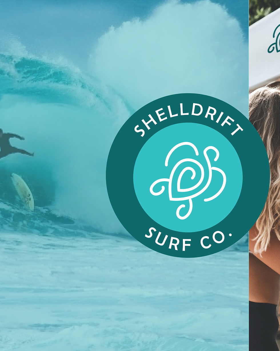
Shell Drift Surf co.
The logo captures the spirit of Queensland’s relaxed beach culture and deep connection to nature
TURTLE
At its heart is a stylized turtle — a nod to the sea turtles that often drift alongside surfers near the shore. The turtle’s swirling shell suggests movement, flow, and balance — qualities that reflect the company’s focus on not just surfing, but also beachside yoga, balance training, and mindful living.
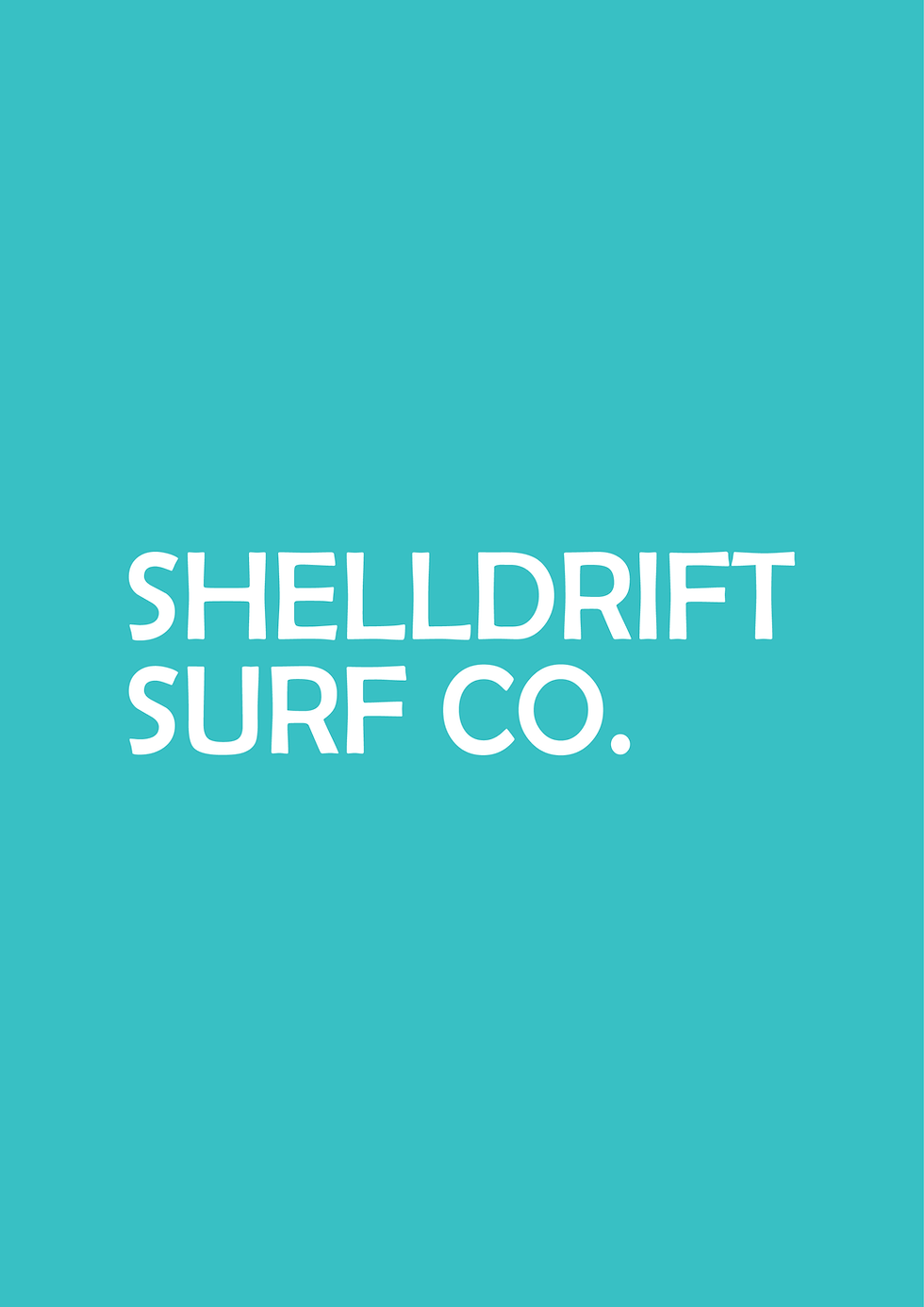
TYPOGRAPHY
The hand-drawn lettering is intentionally rustic and slightly askew, inspired by the tilted beach shack that serves as ShellDrift’s home base. Slightly rounded corners and imperfect edges mirror the curves of well-loved surfboards and the organic rhythm of life by the sea
HARMONY
Altogether, the design feels grounded, playful, and unmistakably coastal — just like the ShellDrift community itself.