LOOKBOOK BELOW
Please note: For confidentiality reasons, certain details have been replaced or redacted in this lookbook.


ORNARE THE LABEL
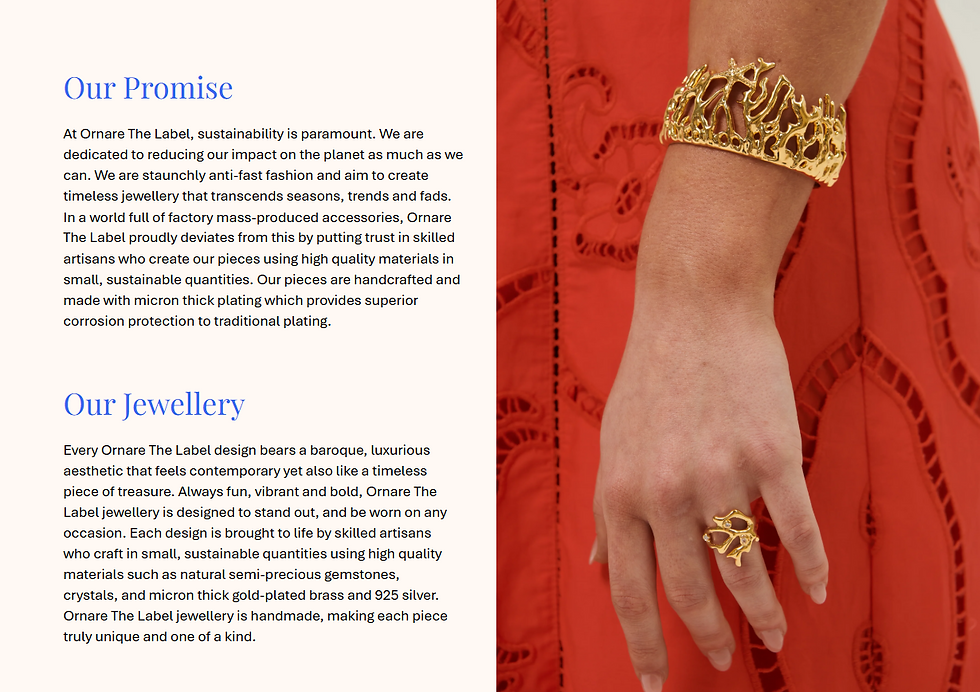
About Ornare The Label: Founded in 2022 by lifelong friends Marisa Suter and Jacinta Capelli, Ornare The Label is a proudly female-owned jewellery brand based in Perth, Western Australia. Their pieces blend baroque-inspired luxury with contemporary design—vibrant, bold, and made to stand out.
The Jewellery: Each design is thoughtfully crafted in small, sustainable batches using high-quality materials like semi-precious gemstones, crystals, and premium gold and rhodium plating. Many pieces are handmade, giving each one a unique, bespoke character.
Commitment to Sustainability: Ornare The Label is committed to slow fashion—partnering with skilled artisans and Responsible Jewellery Council–aligned suppliers to ensure quality, sustainability, and timeless appeal.
This digital lookbook was created to showcase Ornare’s collection in a sleek, refined format. All photography was provided by the client’s professional team. My role involved layout design, text placement, and visual sequencing to ensure each piece was presented with clarity and elegance.


How I helped
Design and produce a premium, high-resolution digital lookbook for Ornare The Label’s Collection, highlighting the detailed craftsmanship and luxurious aesthetic of the jewellery pieces. This lookbook showcases each item through a combination of model photography, product close-ups (in both gold and silver variants), and clearly presented product details.
Deliverables:
-
Fully designed multi-page lookbook 20
Each product section included:
-
One hero image (model wearing the piece)
-
Two detail images (product shown in gold and silver)
-
Product name and description
-
Materials used
-
Wholesale and retail pricing
On-brand layout and typography that aligns with Ornare The Label’s elegant and contemporary aesthetic.
-
Final export in both high-res PDF (for print and digital upload) and a web-optimised version.
Process Includes:
-
Initial concept and layout planning
-
Refinement of image placement and product descriptions
-
Consistency checks across all pages (sizing, alignment, formatting)
-
Final proofing and export
-
Optional: assist with compressed versions for web or e-commerce use
How I helped
Crafted a high-resolution digital presentation for the Y, highlighting their key investment areas with clarity and structure. The design features six modular content blocks styled in a table-inspired layout, making complex information easy to digest for live audiences and digital viewers alike.
This visual format was tailored for flexibility—seamlessly adapting from large-scale projection to tablet viewing—while maintaining brand consistency through colour, typography, and layout.
Deliverables:
-
Fully designed modular-style presentation
-
6 key content blocks presented in a clear, table-inspired format
-
Content includes:
• Investment areas and impact focus
• Clear sectioning for each service area
• Visually structured for ease of reading -
On-brand layout and typography aligned with Y’s bold, professional aesthetic
-
Delivered in high-res format suitable for large-scale projection and digital viewing
-
Web-optimised version included
Process Includes:
-
Concept development and content structure planning
-
Refinement of visual hierarchy and content legibility
-
Consistency checks across all slides (spacing, colour, alignment)
-
Final proofing and export in multiple formats
-
Optional: assistance with compressed files for internal sharing or web upload
PRESENTATIONS BELOW
Please note: For confidentiality reasons, certain details have been replaced or redacted in this presentation mockup.


How I helped
Crafted a high-resolution digital presentation for the Y, highlighting their key investment areas with clarity and structure. The design features six modular content blocks styled in a table-inspired layout, making complex information easy to digest for live audiences and digital viewers alike.
This visual format was tailored for flexibility—seamlessly adapting from large-scale projection to tablet viewing—while maintaining brand consistency through colour, typography, and layout.
Deliverables:
-
Fully designed modular-style presentation
-
6 key content blocks presented in a clear, table-inspired format
-
Content includes:
• Investment areas and impact focus
• Clear sectioning for each service area
• Visually structured for ease of reading -
On-brand layout and typography aligned with Y’s bold, professional aesthetic
-
Delivered in high-res format suitable for large-scale projection and digital viewing
-
Web-optimised version included
Process Includes:
-
Concept development and content structure planning
-
Refinement of visual hierarchy and content legibility
-
Consistency checks across all slides (spacing, colour, alignment)
-
Final proofing and export in multiple formats
-
Optional: assistance with compressed files for internal sharing or web upload